The use case
Kamernet is the largest online platform in the Netherlands that is specifically focused on bringing together the supply and demand of housing for students and starters. Their platform lets you search through available rooms and contact landlords. Each year, more than 260k users find their new home, roommate, or tenant via Kamernet.
However, finding a place can be quite the challenge in the Netherlands and Kamernet doesn’t want its visitors and users to get discouraged early on in the process. This requires relevant messaging and functionality on the website to activate and convert visitors, and more specifically to ensure that more visitors sign up to their service.
With Unless, they saw that nudging the visitors with personalized content and feature components at the right time results in more conversions. Read on to find out how they launched hundreds of experiences and saw transactions skyrocket.
The challenges
The offering on the Kamernet website is very wide-ranging. However, too much choice can also be a curse, leading visitors to get overwhelmed and feel paralyzed.
Kamernet, knowing that their visitors usually search only within a single city of their choice, wanted to present each visitor with information and apartments that will be relevant specifically to them, instead of their complete offering.
The challenge? The Netherlands has more than 300 cities and manually creating different content and functionality for each one of them is too much work. The good news? With Unless, you can add a single feature component that will work for all 300 cities and show different, relevant content each time!
The execution
The main goal for Kamernet was to get more visitors to sign-up so they could receive relevant updates when there were new rooms or apartments in their city of interest. In this case, the Unless components, and overlays in particular, were chosen as they are great at grabbing the attention of your visitors at the right moment.
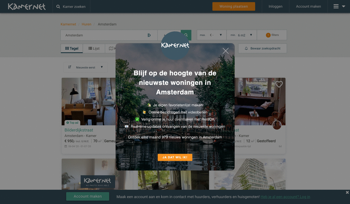
The experience was set in such a way that when a visitor has been searching for rooms in a specific city, at some point they see one of our components. The component itself, an overlay, is personalized to match the city that the visitor is interested in. The headline contains the name of that city, the background image is of that city AND there are even statistics attached informing the visitor of how many apartments are added each month in that city.
This is followed by a call to action to create an account so that the visitor can get notified when new rooms/apartments are added in their city of interest. This allows them not only to remain up to date but also to act fast and get ahead of the competition in applying for that accommodation.
Here you can see examples of the personalized feature component:
 How the overlay component appears for someone looking at rooms in Amsterdam, Leiden, Utrecht, or Rotterdam.*
Results
This one feature component (with 300 variations) alone has been directly converting 1.5% of all visitors. That is a significant result on its own. But of course, Kamernet has been implementing Unless across their website in various ways.
In a four-month period, they launched 130 experiences with Unless, 55 of which were components. Looking at the bigger picture, Kamernet saw 148.9% more accounts registered by using Unless feature components. Additionally, we’ve seen that in the last 30 days alone 42.5% more transactions were initiated via Unless components.
As a marketplace, it can be hard to address both supply and demand with the right message at once. With Unless, we were able to optimize the experience of renters as well as landlords. As a result, we saw a significant uplift in conversions and transactions! - Floris Wesselink, VP of Product
Key Takeaways
- Don’t get overwhelmed, it doesn’t have to be too complicated. We repeat this one often because the best strategy is to take things one step at a time. Identify your goals, identify your audience and then let’s brainstorm what is possible. There might be a way to set up the experiences you’d like in a simpler and quicker way than you think.
- Identify the drop-off points. If you would like to implement components on your website, a lot of their success depends on the timing. You have to trigger them at just the right moment and knowing when visitors lose their attention and don’t convert helps with this.
- Dynamic content insertion is your friend. How can you set up one experience that can look 300 different ways? That is the magic of dynamic content insertion or DCI for short. If you’d like to learn more about it, you can take a look at our Help Center or book a demo so we can walk you through the process and show it in action.


